IDENTIFICATION & PRINTCONTACT
Incentive and Career Program Catalogue for the HR Department
logo design, brand manual extensions
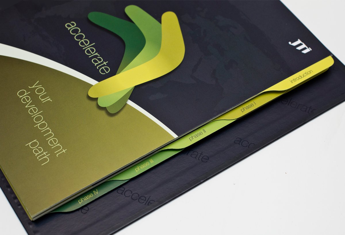
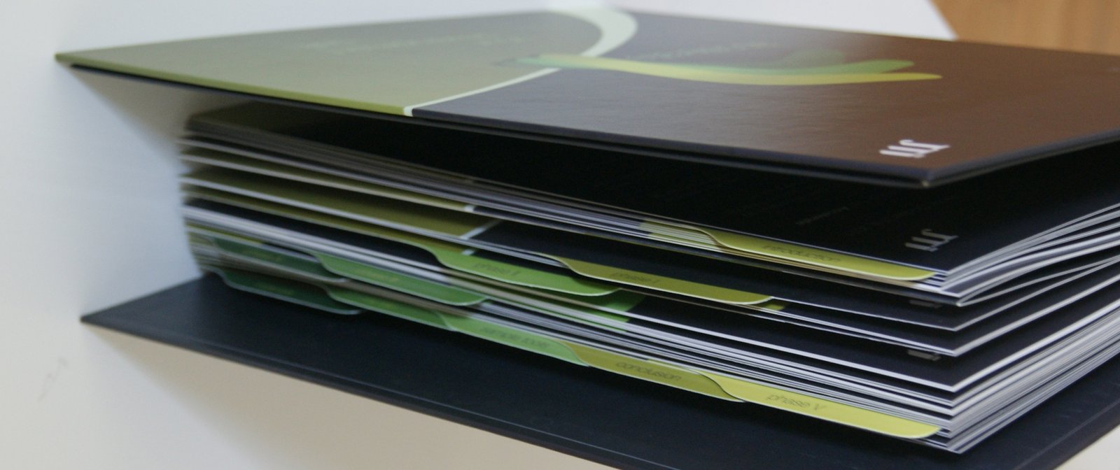
binder form, 10 sections with dedicated colors, consistent shapes for key information
- ClientJTI
- DEPARTMENTHuman Resources
- CLIENT'S SITEEdyta Leśniewska
- ServicesDesign, Art Direction, Production: ADAM WYWROCKI
why a binder form for catalogue has been chosen or why have pages been divided by color on white and dark? If you wanted to know then

Logo Design
- input: name of programme: accelerate || colors: JTI's logotype: green
- output: associations for the shape: accelerate, advance, rise, strenght, instrument, tool
- colors: new colors of green, other than green of JTI's logotype, gradient colors - nobility and quality.
Design details

new greens colors for sections
- A beautifully crafted register with a dedicated color to identify each section's pages
- the oblique line in the background refers to the program name and path of career development
- the world map in the background to emphasize the international character of the company
- program name: "accelerate" distributed in the bottom background inside the cover


- a pocket for loose sheets-notes on the left side inside the cover
- cut rails for business cards
- some shapes looks as keyholes due to key steps in development path

